Responsive Menu Bar with an Icon is a great way of making the Navigation Menu look more noticeable, intuitive, and easily accessible.
Having a Navigation Menu Bar which is fixed to the page helps users with quick navigation within the website and saves scroll time. This enhances the browsing experience and provides users with speedy results.
Most of the free WordPress themes come with a predefined theme position that is hardcoded to the center of the page which is not at all responsive and cannot be altered by the users visually by themselves, until and unless they manually change the code by accessing the style sheet of the theme.
However, not everyone understands code, even if they do, making changes to the Theme files is not recommended as it can break your website design and would cause serious downtime until expert help arrives.
To fix this issue and to make the menu customization process more user-friendly and open to all, we are going to make use of a WordPress Plugin.
In this article, I have discussed how you can build a new Responsive Menu Bar with an Icon and style it as you want without you writing any code using the popular Responsive Menu WordPress Plugin.
>> Jump to the Steps and Make a Responsive Menu Bar with an Icon
How can a Plugin help you build a Responsive Menu Bar
The main purpose of using a plugin to build a Responsive Menu and customize it is to simplify the process in such a way that the users feel confident while customizing their own website and never run out of ideas to make the menu more accessible.
WordPress Menu Customization Plugin will provide us with a more easy and robust way of customizing the navigation menu bar by adding a logo, title text, menus, search box, hyperlinks without directly editing the theme’s style sheet and messing around with it.
Read: How to create a personality quiz in WordPress [9 Simple Steps]
To provide the best visual experience to the user, you need to make a Responsive Menu Bar using the plugin that remains fixed at the top of the page even if the page is scrolled or the user jumps on a new page.
To achieve this, I’ll be using the Responsive Menu Pro plugin that can help us build an amazing Responsive Header Bar easily. It is the best solution for building responsive menus and its intuitive interface makes menu creation a piece of cake.
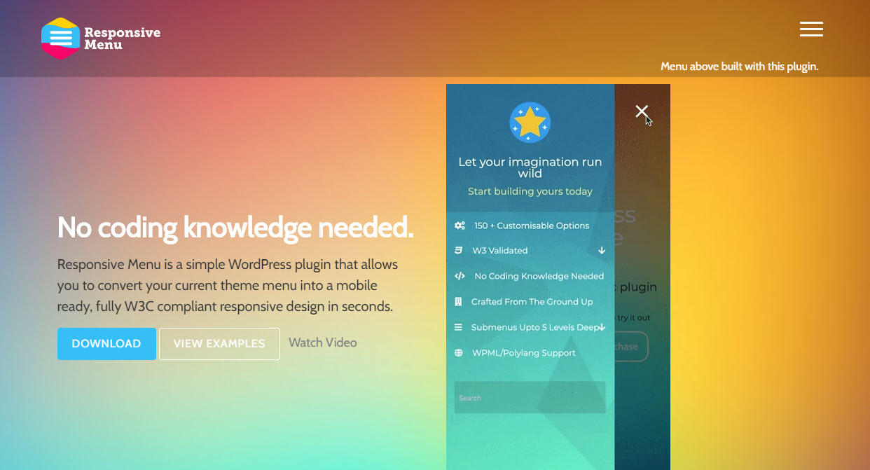
Responsive Menu is 100% mobile, tablet, and desktop friendly and works with all WordPress themes. It features the following components:
- Full responsiveness (can be easily integrated within any website)
- Ability to create either a header bar or desktop menu
- Ability to load a custom logo (supports image types such as JPEG, PNG, BMP, etc.)
- Ability to customize its background style in any color you want for header bar and as well as for different levels of submenus.
- Fully integrated with WPML and Polylang for building multilingual menus
- Keyboard Shortcuts and Gesture support thus boosting accessibility.
Responsive Menu pro can also be used to build Desktop and Mega Menu with tons of customization options. The WordPress Menu Plugin also comes with 600+ Font Icons from FontAwesome and GlyphIcon which can be used for free with the plugin.
Responsive Menu Pro is a no-code plugin, meaning all things you configure will happen visually without you want to write any code. Know the complete list of features of the Responsive Menu Plugin.
Steps to Make a Responsive Menu Bar with an Icon

#1 Create a New Responsive Menu
#2 Create Header Bar
#3 Add Icons to the Menu Items
You need to understand that Responsive Menu is a Free WordPress Plugin that allows you to create an amazing Mobile Responsive Menu in minutes. Whereas, Responsive Menu Pro is a Premium Plugin that needs to be purchased from its website.
First of all, to make a Responsive Menu Bar you will need to install and activate the Responsive Menu Plugin. This process is very simple just go to the Responsive Menu website, Purchase Responsive Menu Pro and install it on your website.
Step 1: Create a New Responsive Menu
After installing Responsive Menu Pro on your WordPress. Create a New Menu by navigating to Responsive Menu > Create New Menu.
Click the Create New Menu button and you are asked to select themes to use. Choose any of the themes or go with the Default Theme and click “Next”.
Read: How to Stop Non-Stop Login Attempts on a WordPress Site?
The “Menu Settings” window opens up, fill the required fields with relevant information.
- Display Condition – Provide a name to the New Menu
- Link WordPress Menu – Choose which WordPress Menu to display
- Hide Theme Menu – Hide Original Theme’s Menu by entering its CSS Selector
- Device Visibility – Control on which devices the menu should be visible
- Display Condition – Select Specific Pages to Display the menu on
After inserting all the details, click “Create Menu” and a new Responsive Menu will be created instantly.
This creates a basic mobile menu now you need to activate the header bar and customize it further to make it more eye-pleasing.
Step 2: Create Header Bar
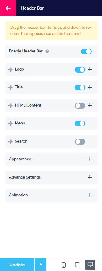
To create a header bar you don’t need to do much. Just navigate to Responsive Menu Customization > Header Bar > Enable Header bar.

After enabling the header bar you will see all the contents of the header bar. Enable/Disable it individually as per your requirement.
As for this example, I will be creating a header bar and adding a logo, title, menus, and search bar. To edit click on the individual components insert the data and toggle the button to enable it.
In the Appearance Section, You can adjust the header bar height, control the padding, specify the font family, set the font size, and select the preferred Text and Background Color.
In the Advanced Settings, you can adjust the header bar breakpoint, set its positioning, you want the header bar to always be visible to the user even while scrolling the page. For that purpose, set the position to “Fixed”.
Also in the animation section, you can enable a scrolling color that gives a different color to the header bar when the user scrolls below the default menu position.
Step 3: Add Icons to the Menu Items
Now to add icons to the header bar menu items you need to go back to the menu Customization window and navigate to the “Menu Styling” option.

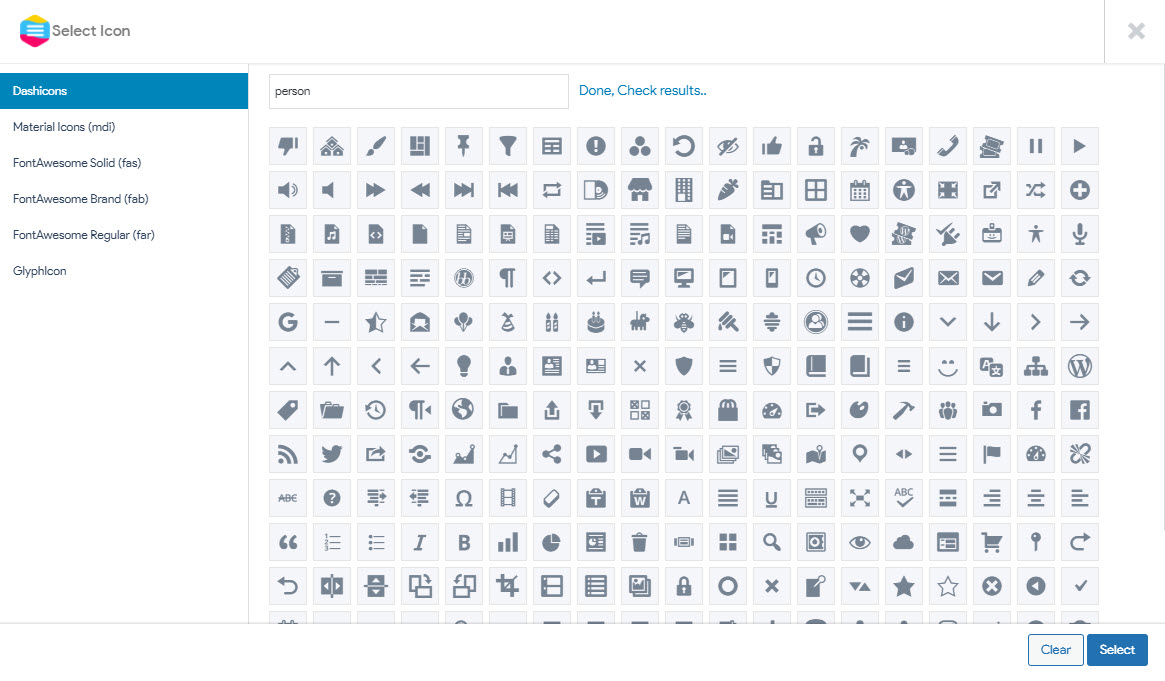
In the “Item Icon” Section, select the menu item from the drop-down and choose the icon from beside where it says “Choose Icon”.

Responsive Menu Pro has hundreds of icons from popular packs like Dashicons, Material Icon (mdi), FontAwesome Solid (fas), FontAwesome Brand (fab), FontAwesome Regular (far), and GlyphIcon.
After setting the icons, click “Update” to save the changes.
In the Same Menu Styling section, you also have the option to Style the Top Level and Sub Menu Items(if you have any) by adjusting the height, padding, setting typography, etc.
Read: How Do You Send Quiz Results to an Email Address? [Email Automation]
You can also set the trigger icon shape, and set its position. You can even replace the trigger icon with text or an image. There’s a lot you can customize and build something unique.
Play with every customization option to build a perfect Responsive Menu Bar that your user will love.
Conclusion
This is how to make a Responsive Menu Bar with an icon using the Responsive Menu Pro Plugin without writing any code.
Easily accessible responsive menus are an absolute must these days. Responsive Menu’s Live Preview feature has proved to a game-changer and speeds up the whole menu creation and customization process.
All thanks to its immersive and intuitive interface in no time you gel in to build amazing menus for your website from scratch like thousands of other Responsive Menu Plugin owners.
Here’s an article that might interest you, How to Add Menu in WordPress? 3 Useful Methods You Must Know!

