Do you want to learn one of the best ways to make a website responsive? If yes, you have fortunately landed in the right article!
Every website these days needs to be responsive in order to support multiple devices currently in operation by the users mainly mobile, tablet, and desktop form factors.
So how do you make your websites mobile-friendly? Well, frankly speaking, there isn’t a single method to designate as the best one. Responsive web design is a combination of different techniques and methods.
In this article, I have discussed how you can make a website responsive using some techniques that require you to code and I’ve also explained how this can be done without writing code by making use of Best WordPress Themes and a Responsive Menu Plugin.
Jump to any of the 3 Ways Directly
#1 Make a Responsive Website Design by Writing Code
#2 Make use of Responsive WordPress Theme
#3 Make your WordPress Navigation Menu Responsive
#1 Make a Responsive Website Design by Writing Code
A responsive design adapts to the available viewport width and, accordingly, rearranges elements to provide an optimal viewing experience.
Responsive web design has been built into HTML5 and CSS3. Optimizing for mobile is still a challenge for many businesses. To make your current website mobile-friendly, you can easily adapt your layout using the methods described below.
- The first step is to add responsive meta tags. This is a new addition to the HTML5 markup language and makes your website device-aware.
- By adding some CSS rules for media queries in the head of your document, you can then adapt not only your layout but also its elements (typography, images, embedded videos) for different devices.
Altering the Layout
Paste the following lines within the head tags on your HTML page. This will make the site render at a 1×1 aspect ratio on all screens, and remove the ability to zoom on it.
Note: Do not add the codes directly on a live website. It is advised to take a backup of your website and test the new codes in a controlled environment locally.
Next is we need to add media queries, Media queries allow you to create designs that look good on all kinds of displays, from smartphones to big screens. It totally depends on your website layout and needs to be altered accordingly.
Paste this code in .css file. The first code block has a maximum width of 1060 pixels, optimized for tablet landscape display. The #primary content occupies 67% of the container width and #secondary 30% with 3% of the left margin.
Read: How to Add Menu in WordPress? 3 Useful Methods You Must Know!
The second code block is for Tablet and Smaller devices, where #primary and #seconday both have a width of 100%.
/* Media Queries: Tablet Landscape */
@media screen and (max-width: 1060px) {
    #primary { width:67%; }
    #secondary { width:30%; margin-left:3%;}
}
/* Media Queries: Tabled Portrait */
@media screen and (max-width: 768px) {
    #primary { width:100%; }
    #secondary { width:100%; margin:0; border:none; }
}
Adjusting the Medias
For a website to be called responsive, the media such as images, videos, etc, must also be optimized.
When optimizing media for different screen sizes, site owners often deal with multiple image versions, stylesheets, and scripts. Having quick access to these files inside WordPress can simplify updates and maintenance. Make use of tools that help manage and organize media and front-end files directly from the dashboard, making it easier to support responsive design workflows.
Using the below code your images will not exceed the parent container in size. Add the code to your CSS file.
img { max-width: 100%; height: auto; }To know more about optimizing media, you must definitely check out this technique.
Better Typography
Most of the websites neglect using better typography. The use of pixels must be avoided when building responsive sites. The font size must be relative to the parent container width to adapt to the varied screen sizes.
With CSS3 units like rems and ems have been introduced, rems are relative to the HTML element and you need to reset the HTML font size. Use the below code
html { font-size:100%; }when done, define the responsive font sizes as shown below:
@media (min-width: 640px) { body {font-size:1rem;} }
@media (min-width:960px) { body {font-size:1.2rem;} }
@media (min-width:1100px) { body {font-size:1.5rem;} }
#2 Make use of Responsive WordPress Theme
Not everyone is an expert in designing websites and this makes most of the site owners consult expert web developers to find a solution to your unresponsive website problem. But, if you think of going on this path be ready to shell out more money than expected.
Web Developers do not have a magic wand using which they can make your website responsive in minutes. They need time to deeply analyze the code and find areas of improvement. In some cases, it can take a couple of days or even weeks.
What if you yourself could make improvements to your website without making your hands dirty and messing around with code, but how are you gonna make your website responsive when it’s already live and has a decent amount of regular visitors?
Read: 9 Fast and Easy WordPress Security Hacks you need to Implement Today
In this case, the best way out is to use a premium responsive theme for your website to transition quickly without losing out on visitors, less downtime (just a few hours), and saving loads of cash.
We will be using the Oshine – Creative WordPress Theme for this purpose.

Oshine is our choice because it has a High-Quality Design and comes with a Powerful drag-and-drop Page builder for building responsive web pages. Also, the theme is available at a one-time license of $59 and guaranteed future updates this makes it worth having.
The theme offers 52+ pre-built demos on various popular niches that can be imported to your site with just a click.
#3 Make your WordPress Navigation Menu Responsive
One of the easiest ways to solve a non-responsive site problem is by replacing your non-responsive website menu with a mobile responsive hamburger menu.
Using the free WordPress Responsive Menu Plugin you can build an amazing-looking WordPress Navigation Menu within a few minutes. Yes, it’s true, that’s how easy it is to build a new Responsive Menu using the free menu plugin.
Install the Responsive Menu Plugin

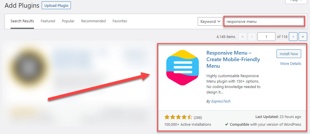
So, to quickly build one for your website. Download the Responsive Menu Plugin from WordPress and install it on your WordPress website and activate it.
Create New Menu
Navigate to the Responsive Menu and Click the “Create New Menu” button. Now you will be asked to choose a theme for your new navigation menu you can even purchase a premium theme.
Read: How to create a form in WordPress and link with PayPal or Stripe?
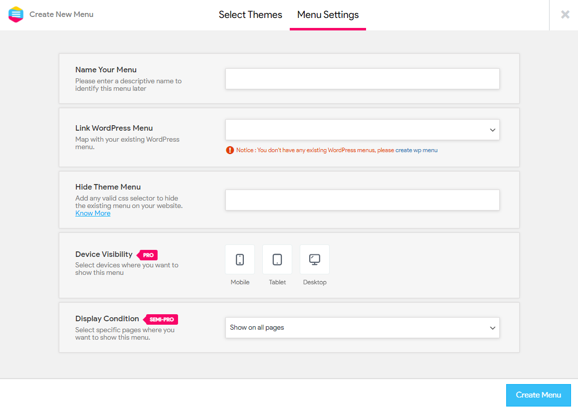
Choose any of the themes to proceed. Next is the Menu Settings, here you need to enter a few details that will create a basic menu for you and you can later customize it with colors and styling.

- Name Your Menu – Give your menu a name
- Link WordPress Menu – Choose the existing WordPress menu to display
- Hide Theme Menu – Enter the CSS Selector of the original theme menu to hide
- Device Visibility – Choose between Mobile, Tablet, and Desktop device to set the menu visibility
- Display Condition – Choose on what pages to display the menu
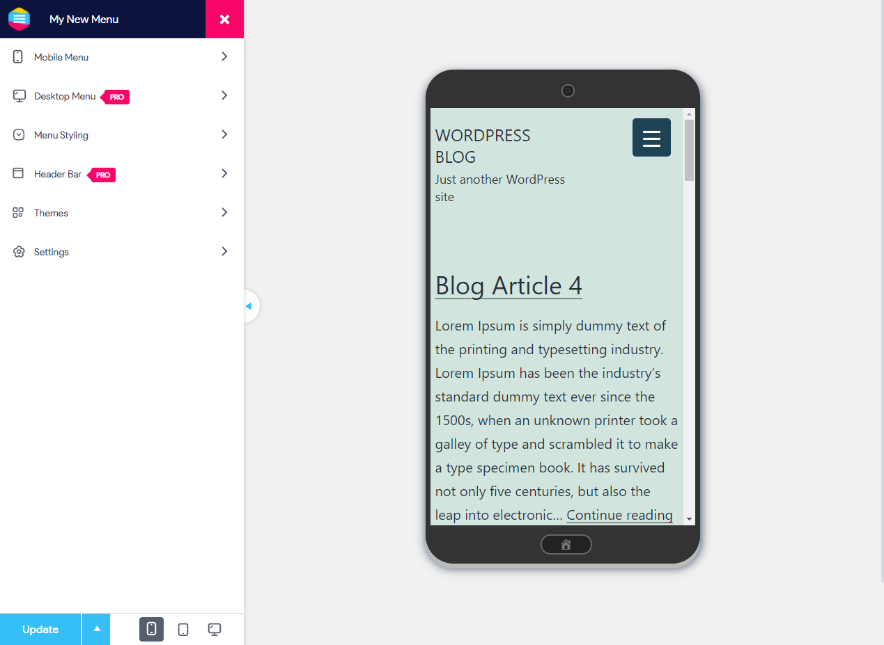
Click “Create Menu” and a Responsive Hamburger Menu will be created instantly with the set settings.
Customize the Mobile Menu

Responsive Menu has tons of customization options using which you can design a cool mobile-friendly menu. The very first option is of the Mobile Menu customization.
Using Mobile Menu Customization option you can customize the Menu Container change background color, add a title, insert additional content, add a background image, and do much more.
Style the Toggle Button by changing its background color, making the toggle button transparent, changing the button position, adding button text, etc.
Learn more about configuring and styling the Mobile Responsive Menu with this article.
You can also buy the Responsive Menu Pro version, to unleash the plugin’s true potential in building a Desktop and Mega Menu.
Responsive Menu Pro also unlocks all the features of the plugin like access to 600+ font icons, creating a header bar, keyboard shortcuts, and gesture control, Multilingual Support, etc.
Conclusion
These were some of the best ways to make a website responsive. You can try and implement any of the said methods depending on your requirement.
Responsive Web Design has completely changed the way we build websites. The techniques behind Responsive Web Design are now universally known, and many of us have started to re-engineer the existing, widely used websites.
Hope you enjoyed reading this article, here’s a summary of what methods we discussed earlier in this article:
- Making a Responsive Website Design with Code
- Installing a Responsive Theme’
- Using a Free Menu Plugin to make Navigation Menus Responsive
Here’s an article that can help you beautify your Mobile Menu with Responsive Menu Premium Themes.

