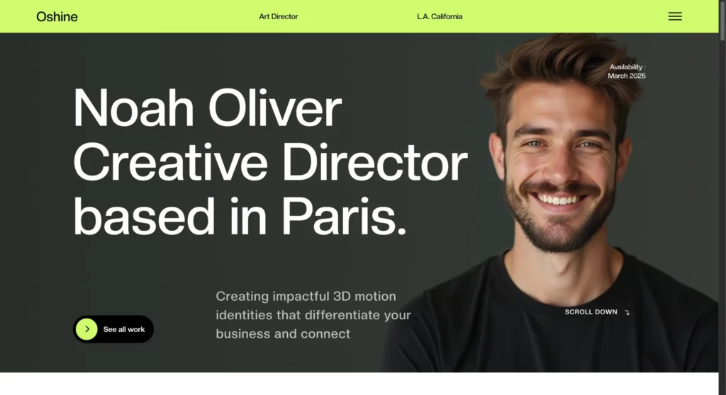
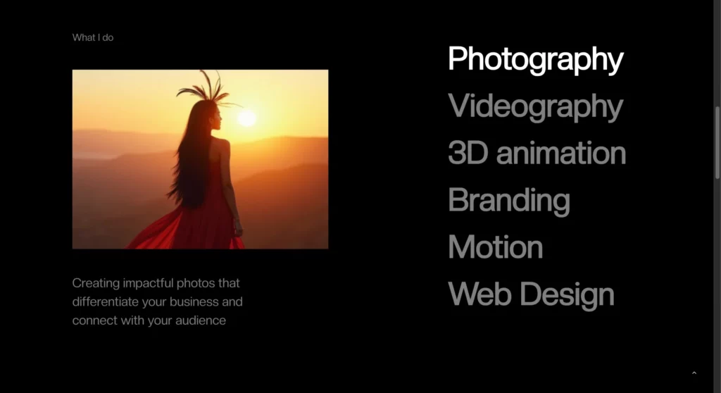
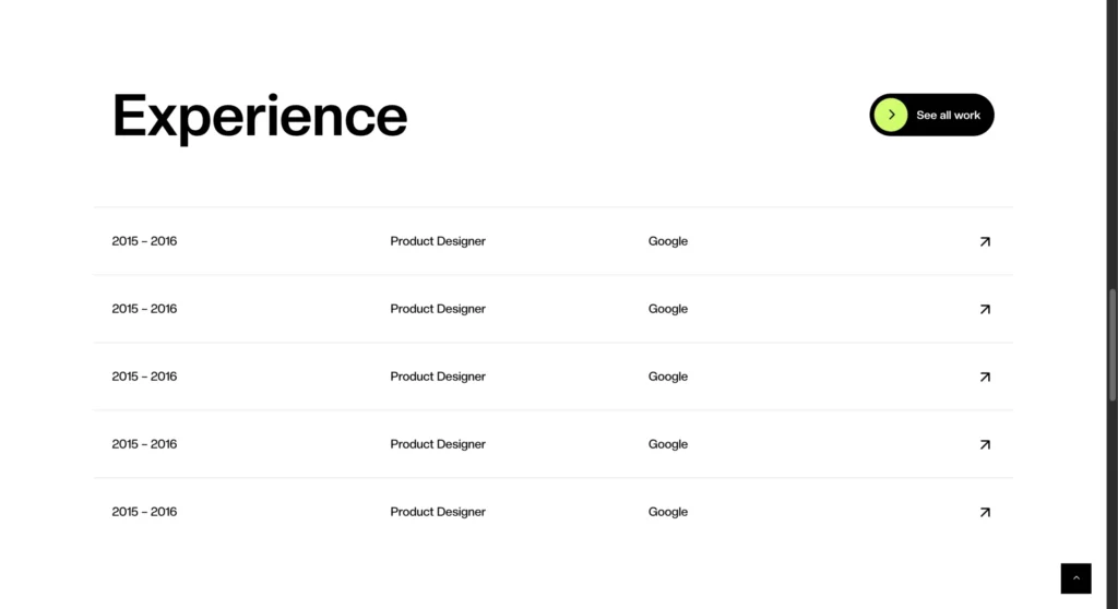
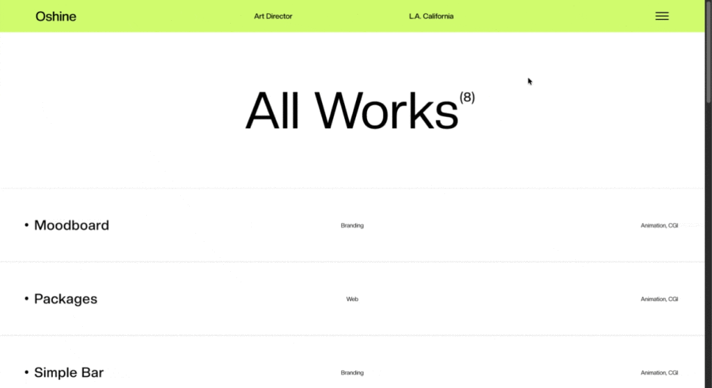
Portfolio websites need to do one thing well: show your work without getting in the way. Oshine Portfolio Demo v62 strips away the excess and focuses on what matters: clean layouts, smart navigation, and giving your projects the attention they deserve.
This update addresses real problems designers and creative professionals run into when building portfolio sites with a WordPress portfolio theme. Tighter spacing, better interaction patterns, and new layout options that actually make sense for different types of work.
Table of Contents
What’s New in Oshine Portfolio Demo v62
The update centers on three main areas: new portfolio templates, refined visual balance, and interaction improvements. Each change came from looking at how people actually use portfolio sites, both as creators and visitors.
New Portfolio Template
The foundation of v62 is a completely new portfolio template structure inside the Oshine Portfolio theme. This template gives you more control over how projects appear and flow on the page. Everything adapts to different content types instead of forcing all your work into one rigid format.

The template handles mixed media better. Photography projects, case studies, video work, and graphic design pieces can all coexist on the same site without looking like they’re fighting for attention. That flexibility is what makes this portfolio theme work for different creative fields.
Navigation has been reworked to be less intrusive. The goal was to keep visitors focused on the work while still making movement between projects effortless. The template achieves this through subtle cues rather than heavy-handed UI elements that compete with your portfolio pieces.
Full-Width Portfolio List
Some projects need space to breathe. The full-width portfolio list gives each project the entire width of the viewport, making the format ideal for landscape photography, architectural work, or any project where horizontal composition matters.
This layout reconsiders how titles, descriptions, and metadata interact with large-format visuals. Text overlays are positioned to complement the imagery rather than obstruct the view. Scrolling feels more deliberate because each project gets its moment before the next one enters view. The format is bold without being aggressive, spacious without feeling empty.
Compact Portfolio List
The compact portfolio list packs more projects into less vertical space while maintaining visual clarity. This layout serves portfolios with dozens or hundreds of pieces where browsing efficiency matters most. Each entry includes a thumbnail, title, category, and optional short description. The grid adapts responsively, showing more columns on wider screens and collapsing gracefully on mobile devices.

Filtering and sorting integrate smoothly, letting visitors narrow down work by type, date, or custom taxonomy. The compact list solves a specific problem: showing variety and volume without overwhelming people. By keeping individual entries consistent in size and spacing, this portfolio theme creates rhythm. Visitors can scan quickly, then dive deeper into what catches their eye.
Hover Reveal Tabs
Tabbed navigation often feels clunky on portfolio sites. Visible tabs take up screen real estate while hidden ones remain undiscovered by visitors. Hover reveal tabs provide a middle path. Move your cursor toward the edge of the screen, and navigation tabs slide into view. Move away, and they recede. The interaction in this portfolio theme is smooth enough to feel natural, like the interface responds to your intent.
This approach works especially well for project detail pages where you want minimal UI during initial viewing but easy access to additional images, information, or related work. The tabs can hold image galleries, project details, credits, or links to other portfolio pieces. The hover trigger zone is generous enough to prevent pixel-hunting but precise enough to avoid accidental triggers during normal scrolling.
Improved Visual Spacing & Layout Balance
Good spacing is invisible until something feels off. V62 tightens up the mathematical relationships between elements. Margins, padding, line height, and whitespace all follow a more consistent scale.
The typography has been refined. Line lengths are better controlled to maintain readability across device sizes. Heading hierarchies are clearer, making establishing visual structure easier without resorting to excessive styling.
Image spacing got particular attention. The gaps between portfolio pieces, the distance between an image and its caption, and the relationship between multiple images in a project have all been calibrated to create better visual flow. The changes in this portfolio theme are subtle individually but compound into a noticeably more polished feel.
Enhanced User Interaction
Interaction improvements in v62 focus on responsiveness and feedback. Links, buttons, and interactive elements have refined hover states that make clickable areas obvious without being cartoonish. Loading states are handled better. When moving between projects or filtering portfolio items, you get clear visual feedback that something is happening. No more wondering if your click registered.

Scrolling behavior is smoother, particularly on project detail pages with multiple images. The template reduces layout shift as content loads, so the page stays stable while you’re trying to read or view work. Touch interactions on mobile devices feel more natural. Swipe gestures, tap targets, and gesture-based navigation have all been refined to meet current mobile web standards.
Who Should Use This Portfolio Theme?
V62 serves specific use cases where its strengths align with what you’re trying to accomplish.

- Designers who need a portfolio that prioritizes their work will appreciate the clean presentation options. Whether you do UI/UX, graphic design, or illustration, the templates emphasize your projects over flashy effects.
- Creative studios with diverse portfolios benefit from the layout flexibility. You can mix project types without the site feeling disjointed. The compact list works well for showing range, while the full-width option lets you highlight key projects.
- Architects often struggle to present their work online because architectural photography needs space and context. The full-width layout gives projects the breathing room required, and the improved spacing makes technical drawings and diagrams more readable.
- Freelancers who want something professional without spending weeks on customization will find v62 hits a good balance. The demo looks polished out of the box but leaves room for personal touches.
- Agencies that need to present client work consistently across different project types will appreciate the template’s adaptability. The hover reveal tabs work well for case studies where you need to present the process alongside the final deliverables.
- Personal brands looking to establish a professional online presence get a solid foundation. The demo stays neutral enough stylistically that you can bend the design to match your personal aesthetic.
How to Get Oshine Portfolio Theme v62?
Oshine Portfolio Theme v62 is available through the standard Oshine theme package. If you already own Oshine, you can access this portfolio theme v62 through the demo import feature in your WordPress dashboard.
New users can purchase Oshine through ThemeForest. The theme includes Portfolio theme v62 along with all other Oshine demos and receives regular updates.
Installation is straightforward. Import the demo content, which includes the template structure and sample portfolio items. From there, replace the sample content with your own work. Most users have a functioning portfolio site within a few hours.
Other Oshine Themes
Oshine extends beyond portfolio sites. The theme includes demos for agencies, businesses, bloggers, and online stores. Each demo is built on the same foundation, so they share performance optimizations and core features while serving different purposes.
- v2 – Carousel: The carousel format puts your photography front and center with smooth transitions between images. Perfect for photographers who want visitors to experience their work as a curated slideshow rather than a static grid.
- v7 – Dark Photography: Dark backgrounds make colorful photography pop and create an immersive viewing experience. This demo works particularly well for moody, dramatic, or high-contrast work where you want the images to feel cinematic.
- v9 – Architecture: Built specifically for architectural projects with layouts that respect the precision and scale of building photography. The demo includes specialized galleries for floor plans, technical drawings, and before/after comparisons. Navigation is structured around project types and building categories, which helps when you’re managing multiple developments or building styles.
- v25 – Modern Digital Agency: Designed for agencies that need to showcase services, team members, and case studies in equal measure. The demo balances visual impact with information density.
- v33 – Minimal Web Design Agency: Stripped-down aesthetic that lets your web design work speak without visual competition from the site itself. Uses generous whitespace and understated typography to create a professional, focused presentation. Ideal for UX/UI designers and development studios.
- v35 – Interior Design: Purpose-built for interior designers with galleries optimized for room photography and material closeups. Before/after sliders and material specification sections come pre-configured, saving setup time.
- v44 – Creative Agency: Flexible enough to handle diverse creative work from branding to video production to editorial design. The demo supports mixed media presentations where each project can have its own layout style.
- v49 – Split Screen Portfolio: Divides the viewport to show two pieces of information simultaneously. Works well for case studies where you want to show the process next to the final deliverables, or for comparing different project approaches side by side.
All demos are compatible with the Oshine framework, meaning you can mix elements from different demos if your needs evolve. Start with a portfolio, add a blog section, and integrate a shop. The theme supports that kind of growth.
Final Thoughts
If you’re evaluating portfolio platforms right now, v62 gives you a working solution that handles the technical side while you focus on curating your projects. The demo imports quickly, customization stays manageable, and the result looks professional without requiring design expertise. You can have a live portfolio site running today instead of spending weeks comparing options or learning complex page builders.
The value here is in the details that save you time. Responsive breakpoints that actually work on real devices. Spacing that looks intentional without manual adjustment. Interaction patterns that visitors understand immediately. These small decisions add up to a portfolio that works properly from day one, letting you get back to the work you actually want to show.
